Red as art: chromatic symbolism in Via Crucis
Fernando Botero (1932–2023) is one of the most recognisable Colombian artists in contemporary Latin American art. His distinctive style is characterised by the depiction of voluminous, exaggeratedly rounded figures—both in portraits and everyday scenes—imbuing his work with a unique identity that blends humour, social critique, and a monumental aesthetic. This visual language has left a profound mark on contemporary painting and sculpture, establishing him as a leading figure in 20th-century art.
The piece created by the artist in collaboration with ARTIKA is presented as a personal interpretation of the Via Crucis. Throughout the series, Botero’s distinctive vision of the biblical narrative unfolds alongside its projection into the present, revealing parallels with his native Colombia as well as with the contemporary world. In doing so, Botero joins artists such as Michelangelo, El Greco, Rembrandt, and Velázquez, all of whom reinterpreted the story of the Passion. In this series, he recreates scenes from the New Testament, infusing them with a singular style that unmistakably defines his work.
This edition demonstrates that colour does not merely accompany the artistic sequence—it constructs it. Among all the hues that run through his paintings, one pulses with particular intensity and assumes a leading role in many of his compositions: red. In his renewed vision of the Passion of Christ, this tone is not solely blood; it becomes atmosphere, tension, memory, and presence, ultimately transforming into a visual language that permeates the entire body of work.
Ecce Homo, 2010. Oil on canvas, 234 × 137 cm. Museum of Antioquia, Medellín, Colombia. @carlostobonelfotografo.
Red as a forewarning of pain
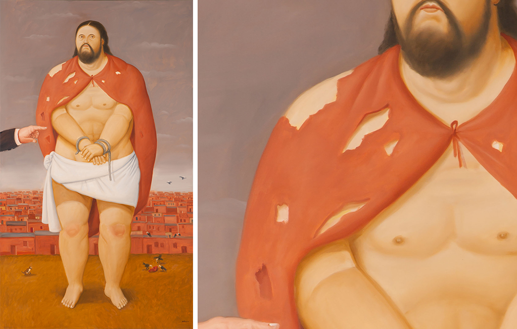
In Ecce Homo (2010), Jesus stands with bound hands at the moment preceding the Crucifixion. Here, Botero does not depict a distant or idealised figure; instead, he humanises Christ and brings him closer to the viewer.
The environment surrounding Jesus—the crowd, the sky, the entire atmosphere—is rendered in an intense red. Even the cloak he wears, torn and fragile, shares this dominant hue. This chromatic choice is far from decorative; it operates as a narrative device. The colour appears before pain is explicitly manifested. It does not describe violence—it foretells it. Acting as a visual omen, it prepares the viewer for the tragedy to come.
Botero employs red as an emotional prelude to the scene. The viewer perceives it even before consciously processing it. It is a silent tension that runs through the composition, transforming colour into a language of its own—capable of anticipating suffering without directly depicting it.
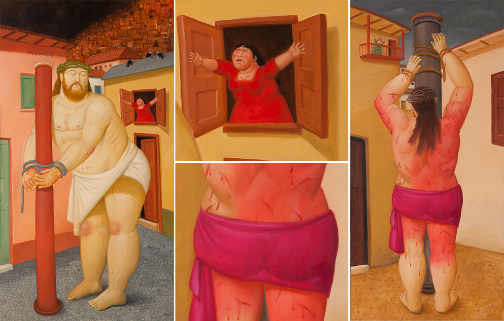
Left.: Cristo en la columna, 2010. Oil on canvas, 204 × 110 cm. Museum of Antioquia, Medellín, Colombia. @carlostobonelfotografo.
Right.: Flagelación de Cristo (detalle), 2010. Oil on canvas, 205 × 99 cm. Museum of Antioquia, Medellín, Colombia. @carlostobonelfotografo.
Red contained, not torn apart
Christ at the column and The flagellation of Christ, both created in 2010, depict two consecutive moments within the same scene of suffering. Although they portray episodes charged with violence, the artist softens their harshness, transforming brutality into a restrained, almost silent image.
There are no furious brushstrokes or excessive gestures. The red that dominates the composition is flat, compact, and solid—almost as if carved. This chromatic restraint reshapes the experience of pain. It does not erupt; instead, it becomes a steady, inevitable presence, whose weight lies more in its stillness than in overt drama. Here, colour functions as a space in which pain is contained and violence acquires an almost ritual character, suspended in a seemingly frozen time.
The only figure that disrupts this restraint is the woman at the window in The flagellation of Christ. Also dressed in red, she embodies a grief that cannot be suppressed.
Red as volume
Volume is an essential element in Botero’s work. His figures possess a monumental, almost tactile corporeality. In this context, red does not merely provide colour; it shapes and models form, reinforcing a sense of weight and density.
In The Nuncio (1970), Botero portrays the power and authority of the Church. This painting belongs to a group of paintings in which he uses ecclesiastical figures to explore volume, form, and vibrant tonalities, demystifying the figure of the nuncio and presenting it as an aesthetic icon rather than a purely religious one.
Between the sacred and the earthly
Throughout history, red has been a colour laden with meaning. In Via Crucis, this tension remains vividly present. In The burial of Christ (2010), Botero places an angel at the centre of the composition, and it is precisely this figure that wears red, becoming a focal point that radiates symbolism.
Although the scene represents a moment of profound sorrow—the carrying of Christ’s body after the Crucifixion—it takes on a distinctive character. Its luminous palette, rounded forms, and the serenity of the figures transform tragedy into a contemplative image, even tinged with subtle irony.
Botero neither spiritualises red nor reduces it to a purely decorative element. Instead, he situates it at the threshold where the human and the sacred meet and engage in dialogue—a point of convergence between life and death. This use of colour becomes an interpretative key, inviting the viewer to approach the scene through a contemporary lens.
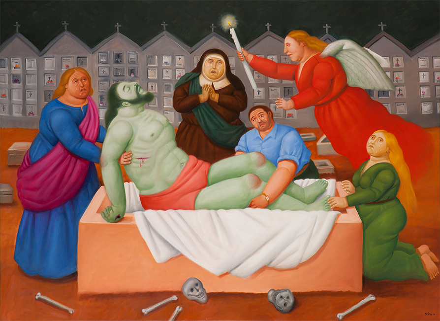
Entierro de Cristo, 2010. Oil on canvas, 150 × 203 cm. Museum of Antioquia, Medellín, Colombia. @carlostobonelfotografo.
The colours of collective memory
Within the Latin American context, red may evoke additional readings: historical violence, conflict, and social wounds. Without turning his creations into explicit political allegories, Botero employs this palette as a symbol of a broader cultural memory. It does not impose itself as a message, yet it remains latent.
The contemporary viewer does not perceive red from a neutral standpoint. It is at this moment that the chromatic language becomes activated, allowing each individual to interpret the works through their own historical experience.
Fernando Botero’s work transcends the mere representation of a visual universe composed of voluminous figures and vibrant colours, leaving an indelible mark on the history of art. With Via Crucis, the artist reaffirms his ability to reinterpret universal themes through a personal lens, creating a space where volume becomes language, colour becomes emotion, and tradition becomes a territory for reinvention.
Today, his work continues to engage audiences around the world—not only because of its unmistakable style, but also for the way it addresses beauty, pain, power, and memory. Each piece invites us to look again, to pause, and to contemplate art through a renewed sensibility.
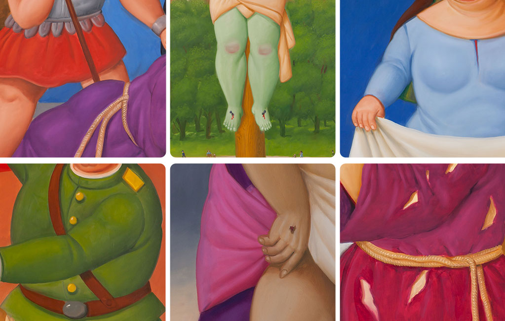
Details of various works by Botero in Via Crucis.
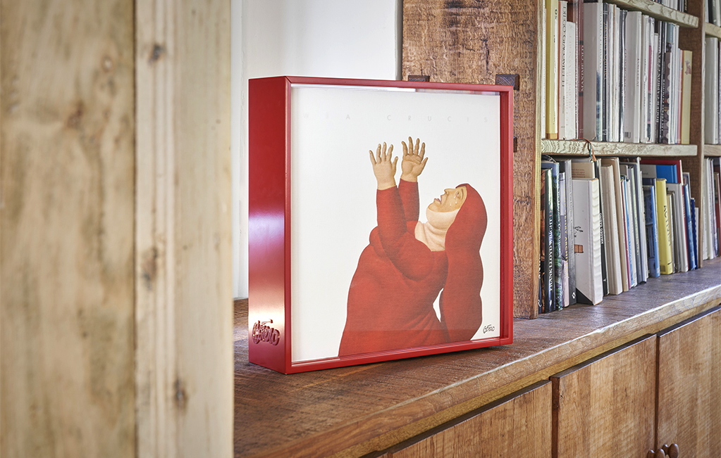
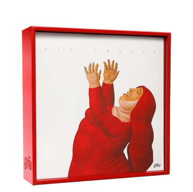
VIA CRUCIS, an emotional journey through form and colour
- A numbered, limited edition of 2,998 copies, produced in collaboration with the artist and the Museo de Antioquia.
- Comprising two volumes, presented in a display case featuring a silhouetted detail from the oil painting Near the Cross, previously unpublished, which precedes the cover of the Art Book.
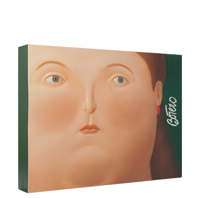
- The Art Book includes 34 plates depicting the Passion of Christ through scenes reinterpreted by the artist in his unique style, each accompanied by a biblical quotation.
- The Study Book features contributions from leading experts, examining Botero’s social, cultural, and artistic role on a global scale, as well as analysing his body of work and each plate in the edition.